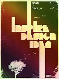
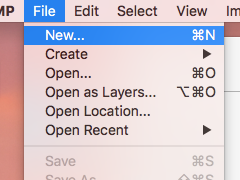
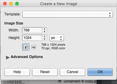
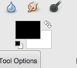
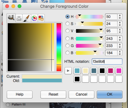
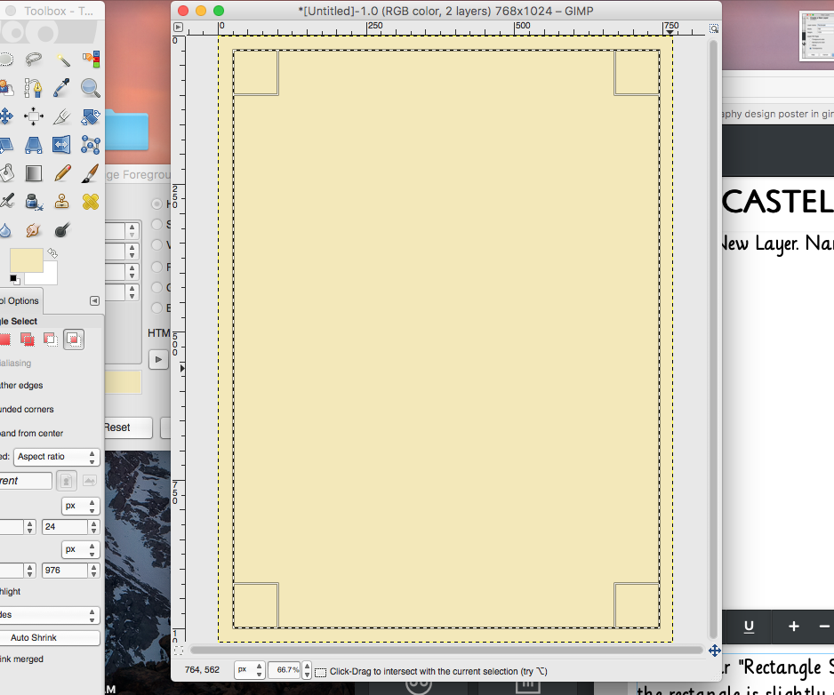
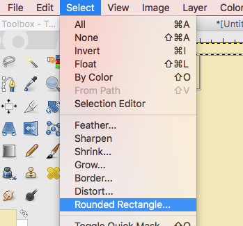
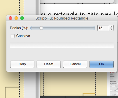
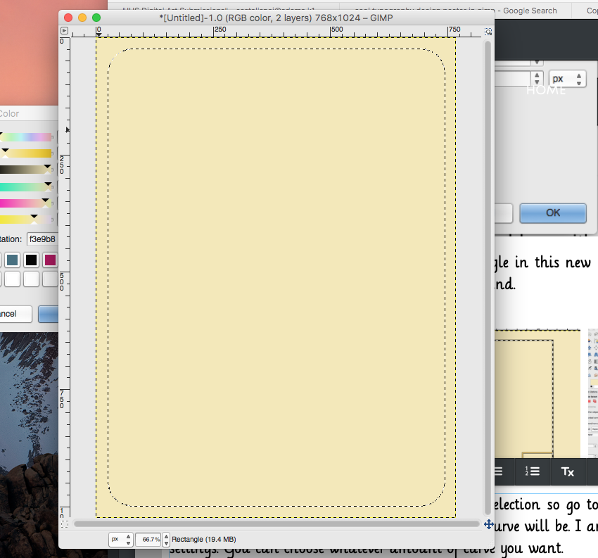
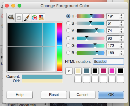
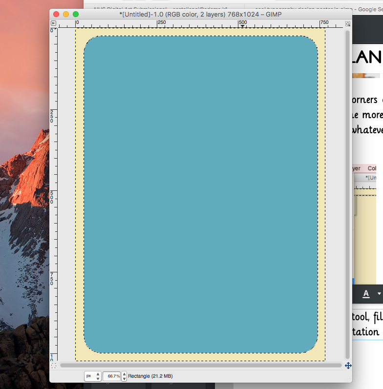
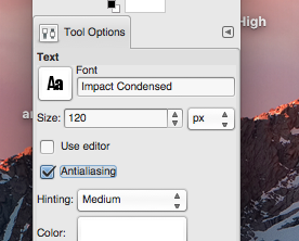
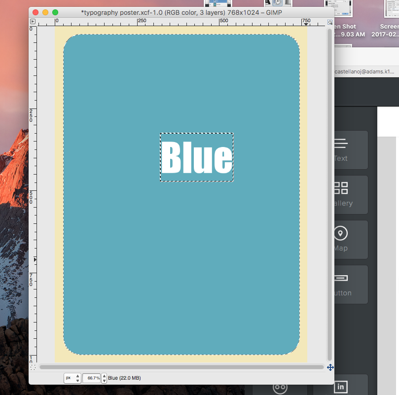
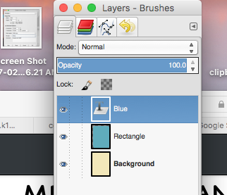
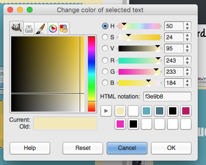
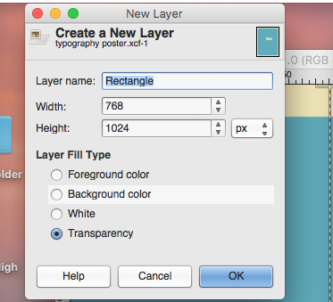
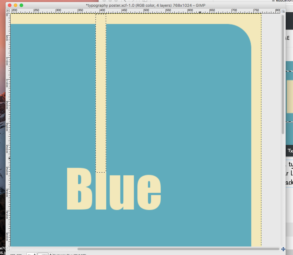
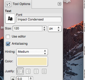
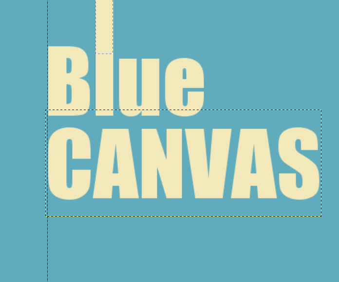
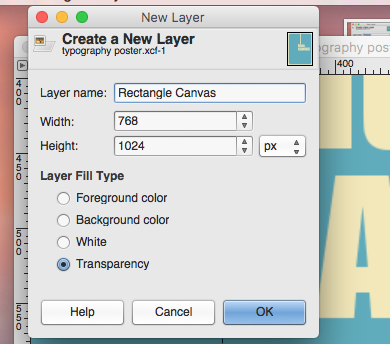
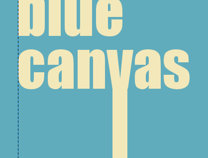
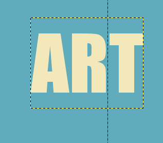
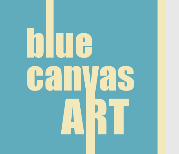
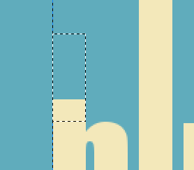
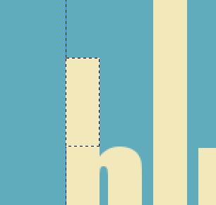
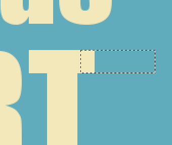
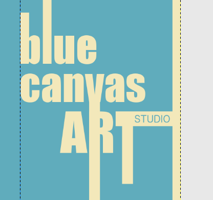
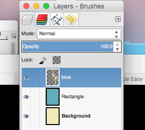
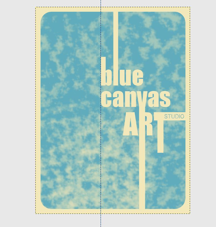
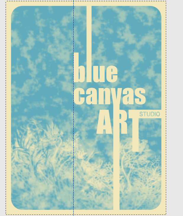
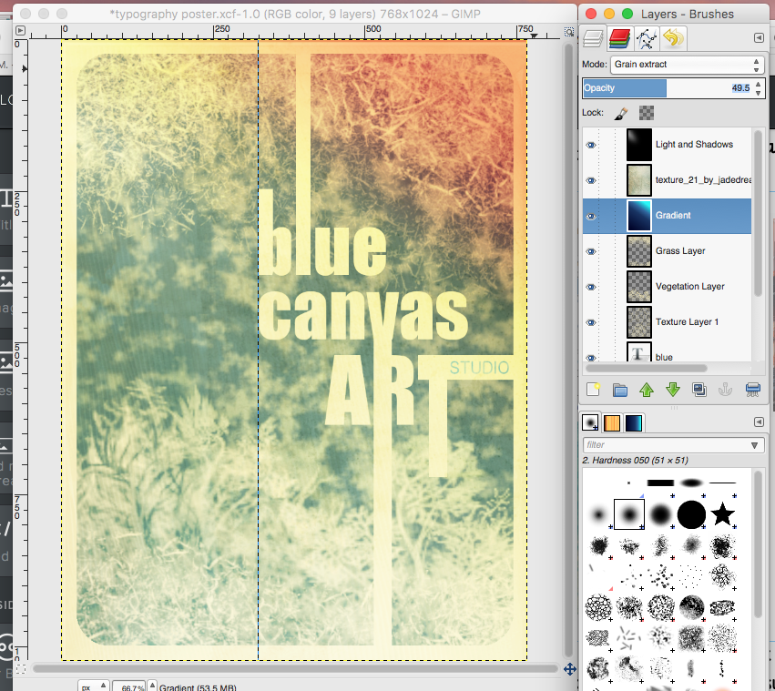
 For this next project you will be creating a typography design poster. We will learn how to make some elements look rough or dirty, add texture, and create depth using light effects. We will focus Design Principles of Contrast, Emphasis, and Rhythm. Although I have created a step by step tutorial. You may choose whatever fonts, colors and images that will affect your final design. These will all look VERY different at the end. You still need to follow the instructions and use each tool that I use. But feel free to play around with settings and colors so that you get the look you want for your poster. I will be creating a poster for my art studio....Blue Canvas Art Studio....you may choose whatever you want. A local business, made up business, a quote or song lyric, a band or team.....anything goes. What to do....First you will need to create a New Document in GIMP. Set the Image Size to 768X1024 pixels. Make sure the Portrait orientation is selected. Click on your foreground color to change it. Choose whatever color you would like to use (this color will eventually be a thin border around the edge of your poster.) I went with a neutral tan color. If you look on the right side of the Change Foreground Color window you will see where you can enter a code under "HTML Notation"--the code for the color I used is f3e9b8 Using your paint bucket tool, fill in your background layer with this new color. Create a New Layer. Name this layer "Rectangle" with the background set as "Transparency" 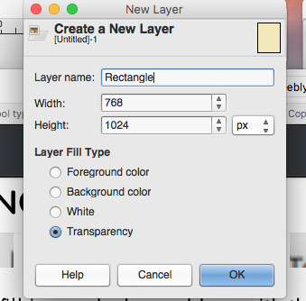 Using your "Rectangle Select Tool" draw a rectangle in this new layer. Adjust the size so that the rectangle is slightly smaller than the background. We want to round the corners of this rectangle selection so go to Select-->Rounded Rectangle. The higher the Radius the more pronounced the curve will be. I am going to go with 15 for my settings. You can choose whatever amount of curve you want. Using your "Bucket Fill" tool, fill this rectangle with a different color. I am going to go with a medium blue (HTML Notation 5dacbd)--you want to make sure you do not choose too light of a color for this layer. Next, we will create some text. For the Typeface, I used a font called Impact Condensed....(choose whatever you like--this font should be bold)....my font size is set at 120....yours may be different depending on the font you choose. Either way this should be large so start at 120 and you can adjust it later. Click any where on your image and type the first word of your poster. Using your Move Tool, you can position the word wherever you want. Double check your Layers Window to see that they are in the correct order. Make your font color the same color of your background. Create a New Layer. Name this layer, "Rectangle (word you typed)" Using the Rectangle Select Tool, create a rectangle extending from the top of one of your letters...make your rectangle go all the way to the top of your canvas. Fill it with the original background color (f3e9b8). Create another Text Layer using the Type Tool. Using the same font (size can change depending on what you are typing) type in your second line and move it to the right place below you first word. Create another New Layer and name it "Rectangle (second word you typed)". Repeat the same steps as before to draw a rectangle extending from a letter in this word to the bottom of your image. Fill it with your background color. Select the Type Tool again and type your 3rd and final line....I am using ART. Use the same background color but play around with the font size until you find the right look. Move your text so that one letter lines up with the bottom rectangle. Create another new layer. Play around with your rectangle select tool to add more shape to your text. Name that layer "Extra Shapes" with the background fill set as Transparency. 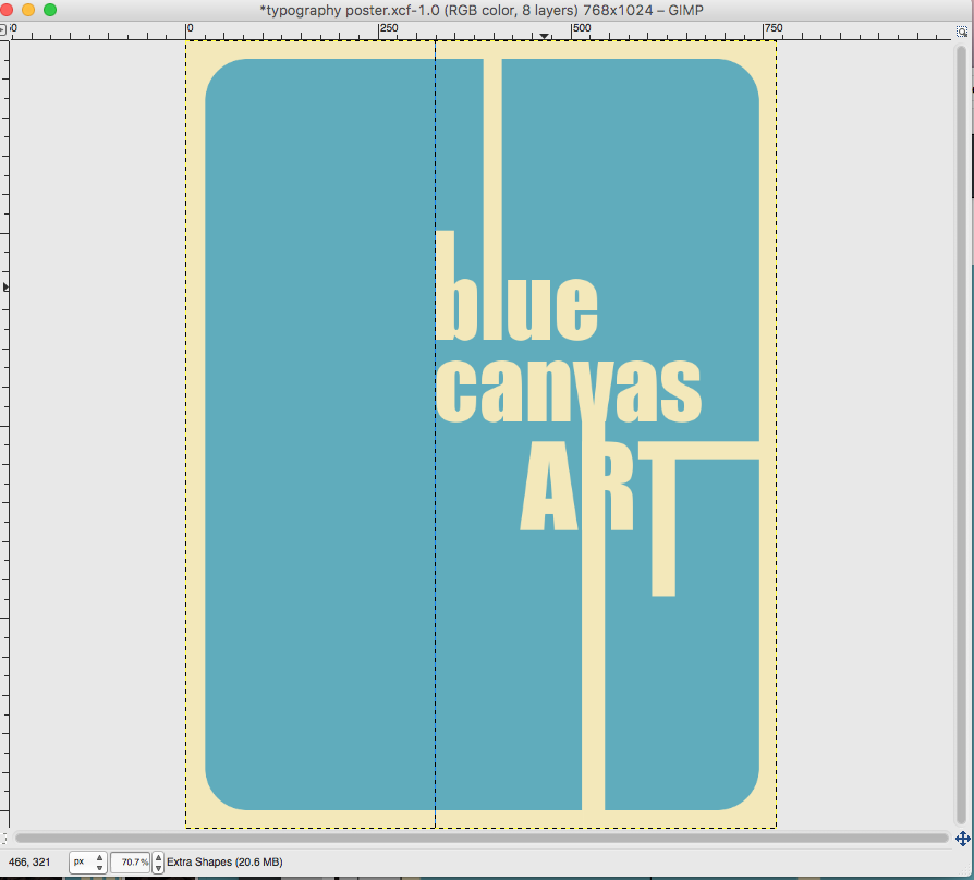
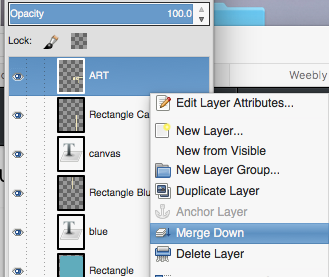
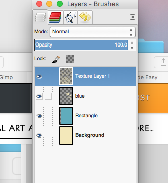
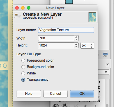
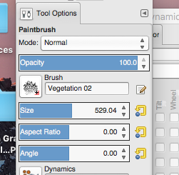
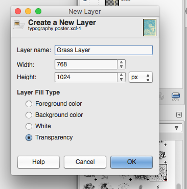
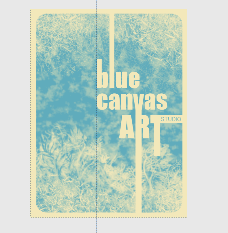
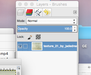
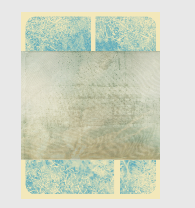
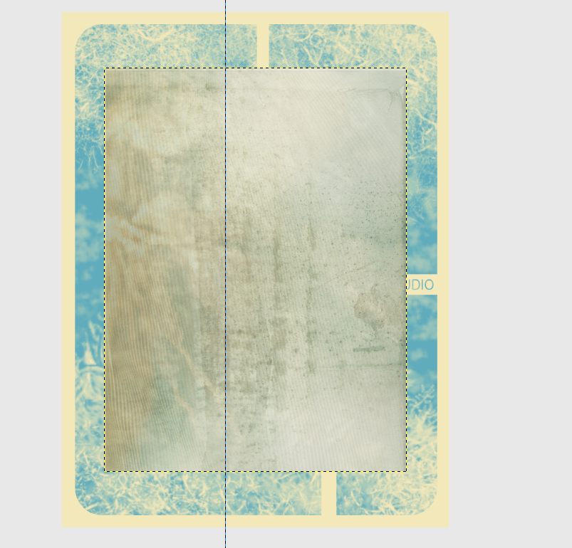
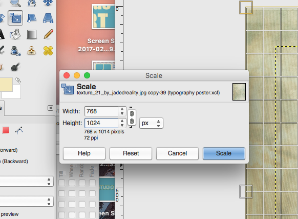
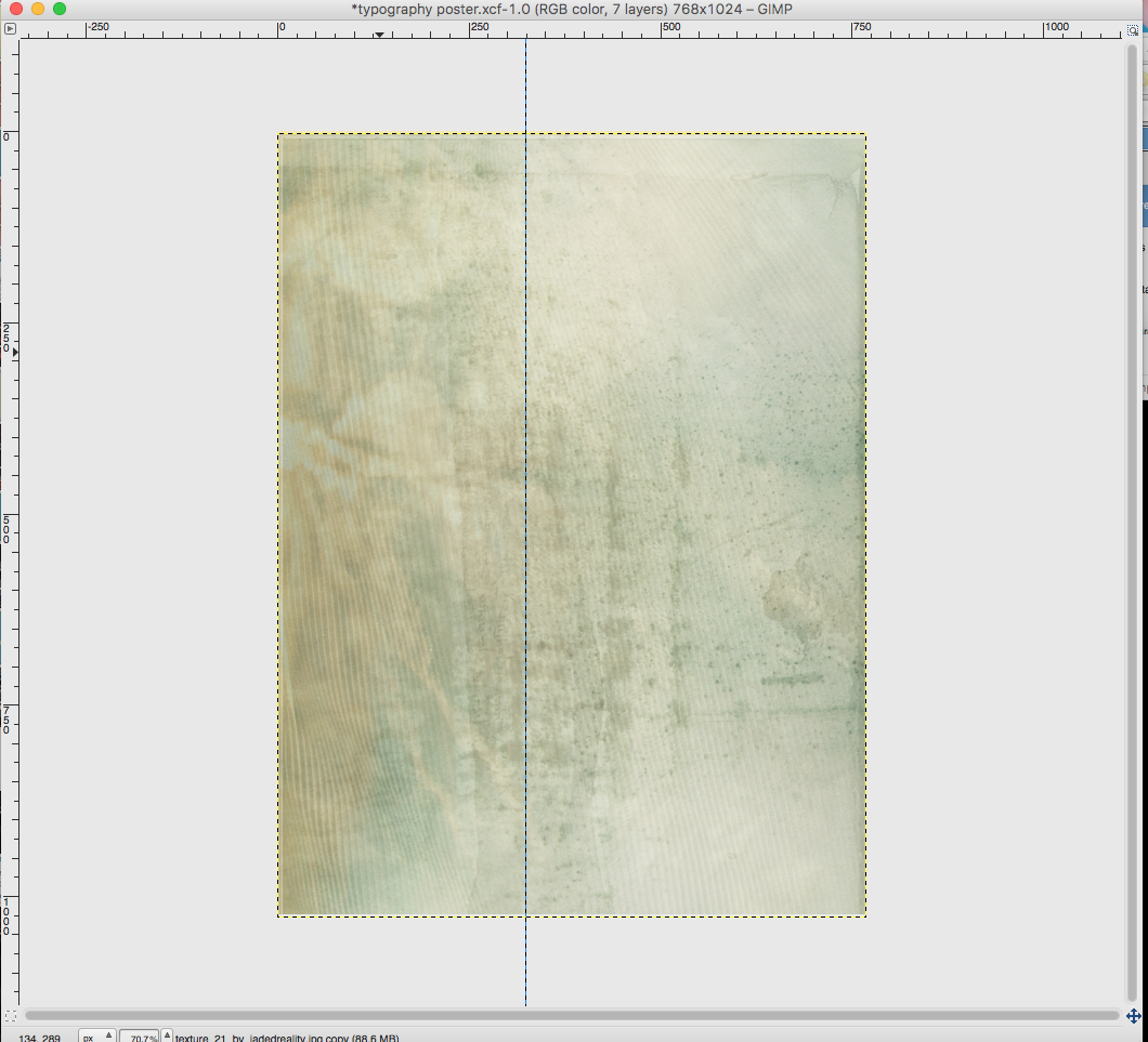
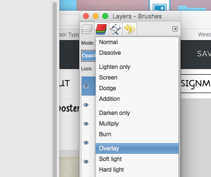
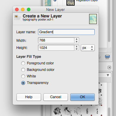
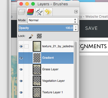
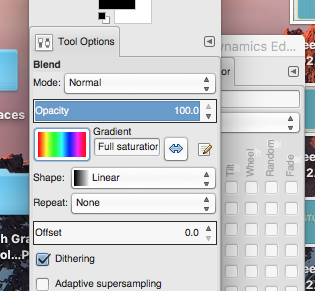
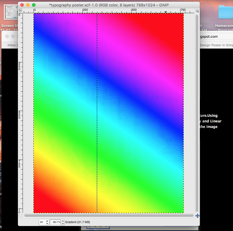
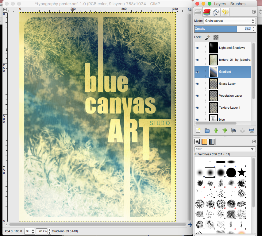
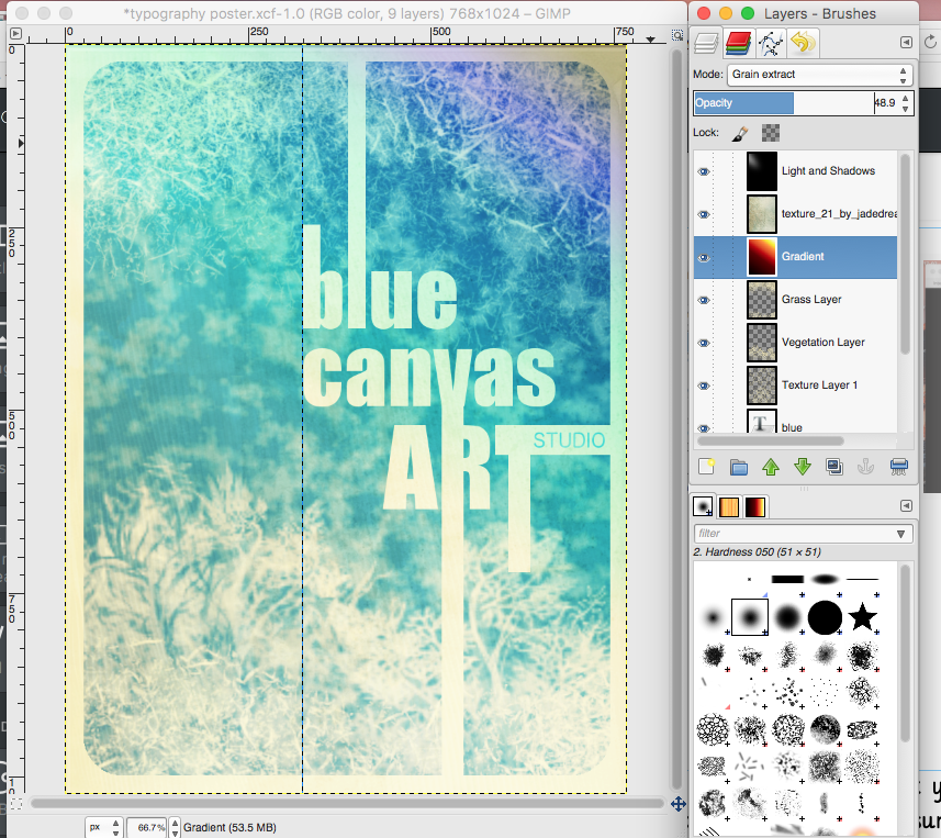
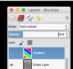
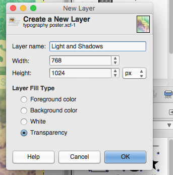
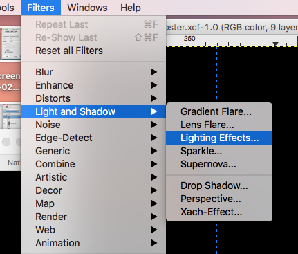
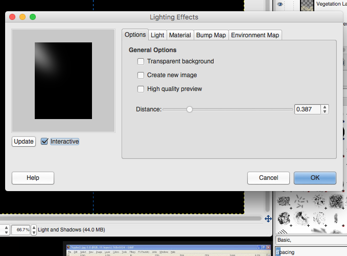
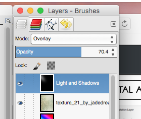
Next you will "MERGE" all text layers into one. With your top layer selected, Right Click or Control Click on that layer and select merge down. This will merge the first two layers together. Continue to do this until you have merged all of your text layers together. DO NOT merge with your back ground rectangles just yet. Remember, once you do this you will not be able to move around your text separately...it will all be one layer. Create a new layer. Name this layer "Texture Layer 1". Explore different brushes to create some texture in the background. Don't go overboard as we will be adding a lot more to the image. You will probably want your brush size to be quite large so that you can just click once or twice to stamp a texture onto your rectangle. I chose to use the Chalk 02 Brush--Size 821. I also changed the opacity of the brush to Create another new layer to add some more texture (I used the vegetation 02 brush so I named this layer Vegetation). Stamp this new texture at the bottom, or side of your text to create some variety--Set the opacity of this brush to 100. Create Another New Texture Layer (I chose to use Grass as my brush). Experiment with Brush Size and Opacity to get another layer of texture on your image. Be careful not to stamp a High Opacity Brush right over your text layer. You will need to Save this Image to your computer and Open it in GIMP. 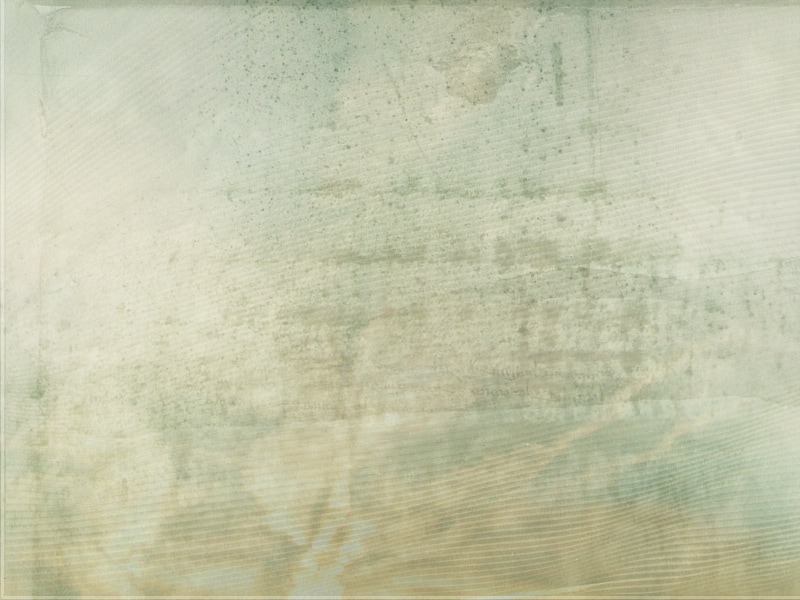 Drag the "Texture" Layer onto your poster design. Rotate the image using the Rotate Tool (90 Degrees) Using the Scale Tool, change the size of this layer to fit the size of your poster (768X1024 Pixels) Set the Layer Mode to OVERLAY Create a new layer and name it "Gradient". Place it behind....or underneath the Texture Layer you just created. In the Tool Options window select your gradient type (I chose Full Saturation Spectrum--there are three other options displayed below). Set the Shape to Linear and keep the Opacity at 100. Click and drag from one corner to the other. In your layers window. Set the Mode to Grain Extract and set your Opacity of this layer to 24.8--whatever it takes to see your poster again. Check to make sure your layers are in the right order. Now create a new layer on top. Name it "Light and Shadows". Fill it with Black. Go to Filter-->Light and Shadows--> Lighting Effects. Play around with the settings until you get a light effect that you want. Apply the filter. Set the Layer Mode to Overlay and adjust the OPACITY if you need to. 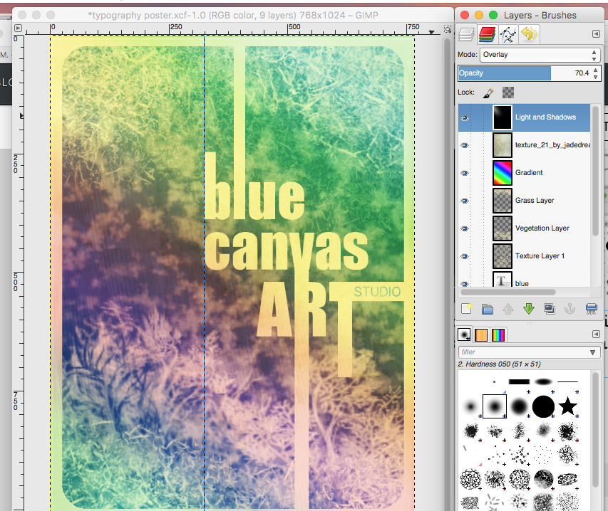 When you are finished go to File-->Export As to export your poster as a .png
Email your final poster to me.
1 Comment
|
Mrs. CastellanoDigital Art Archives
May 2017
Categories
All
|


 RSS Feed