|
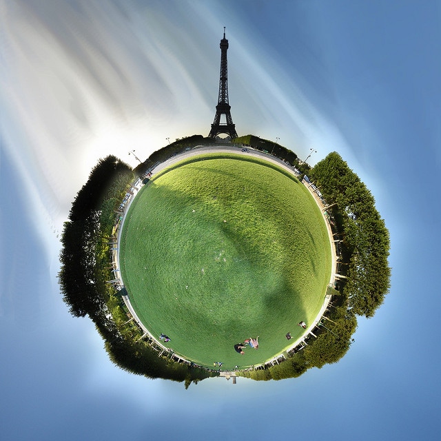
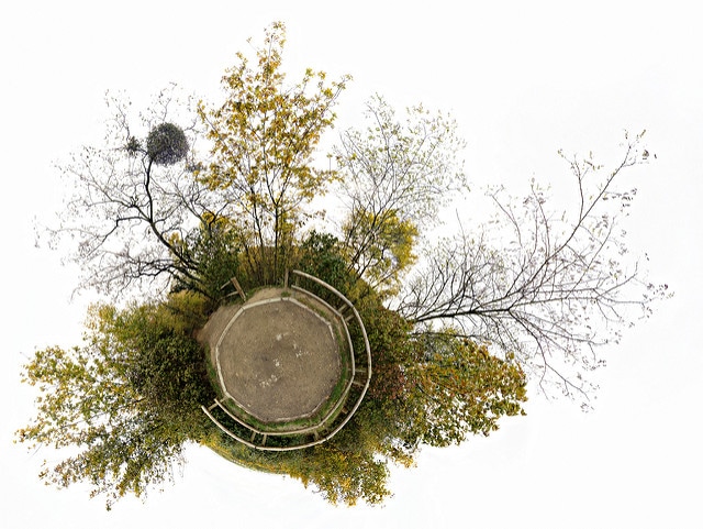
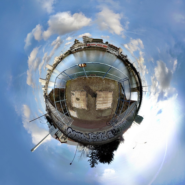
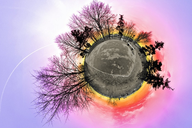
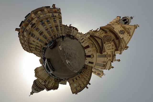
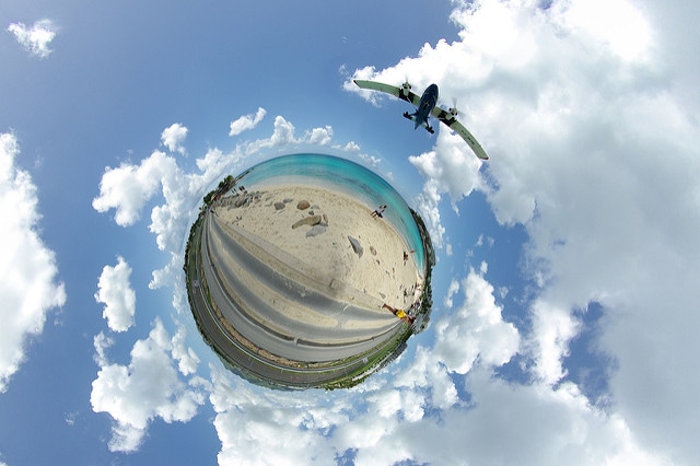
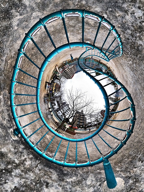
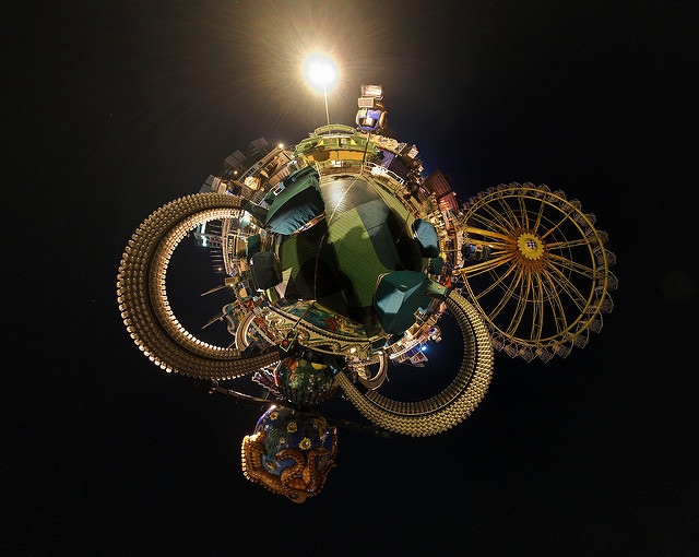
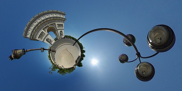
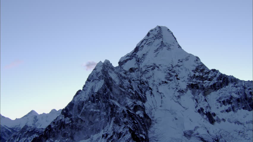
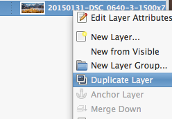
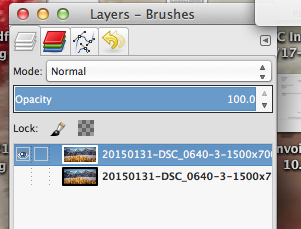
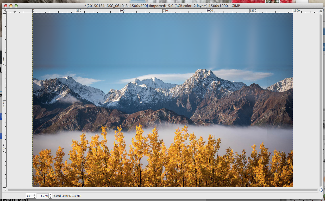
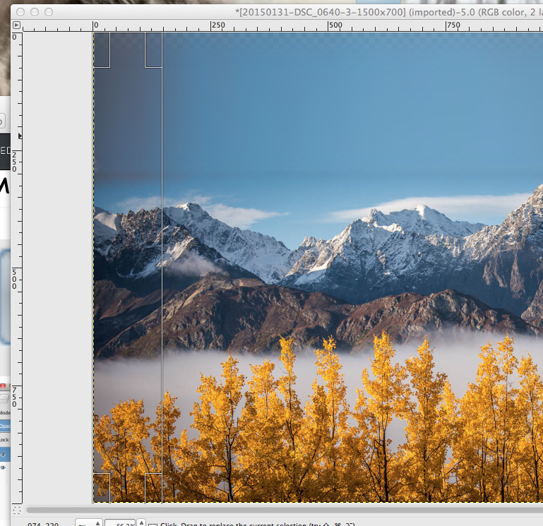
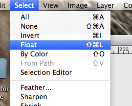
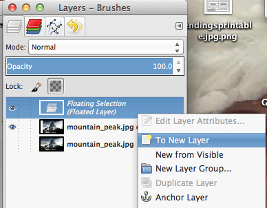
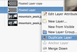
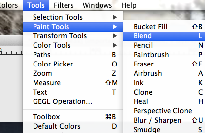
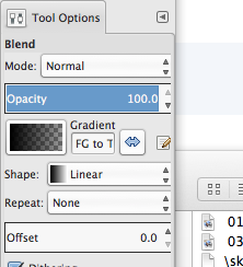
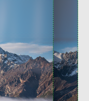
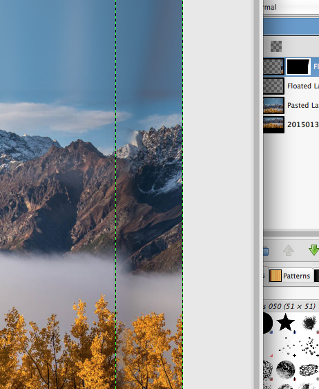
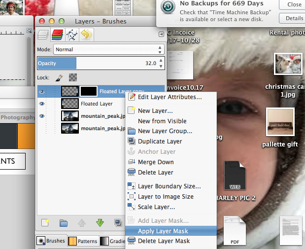
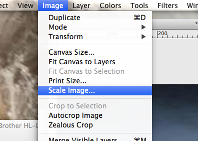
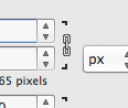
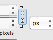
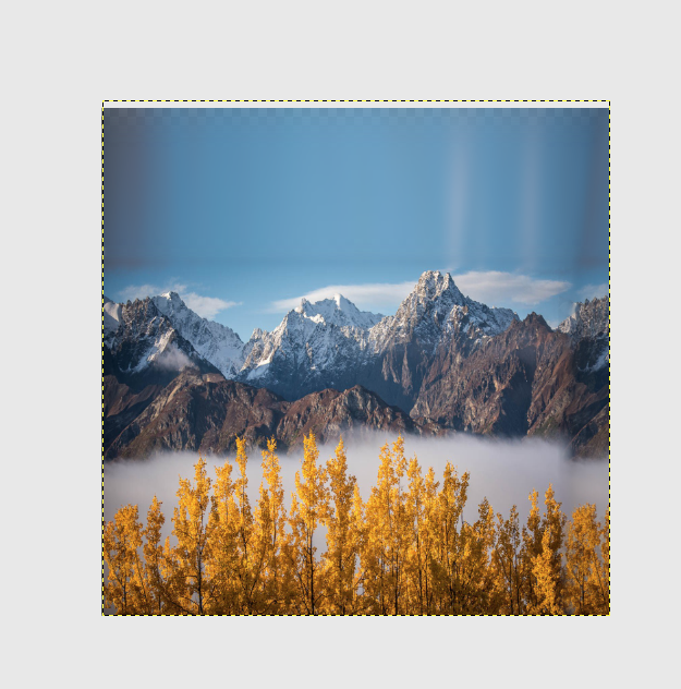
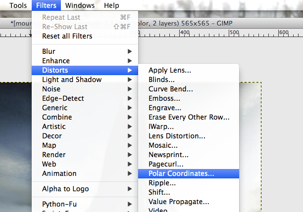
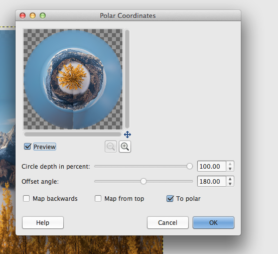
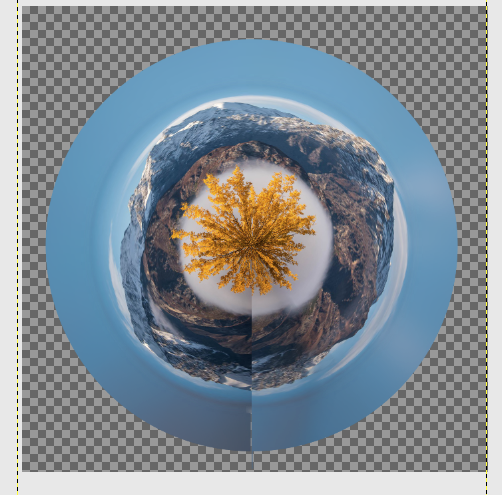
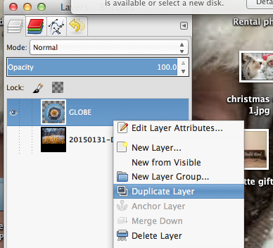
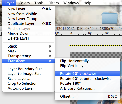
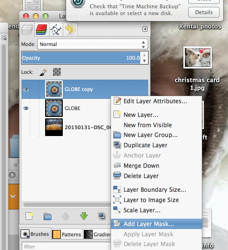
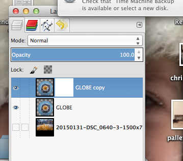
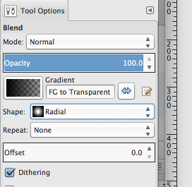
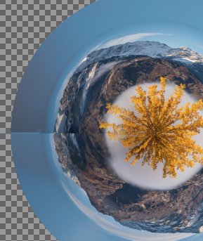
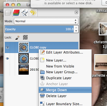
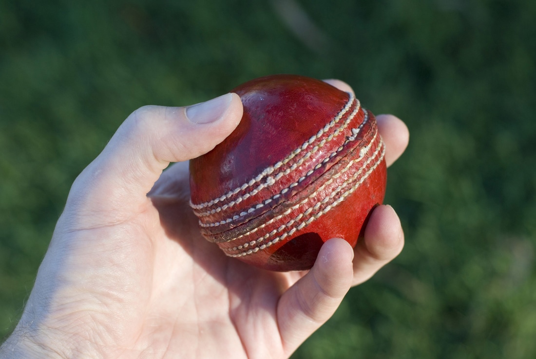
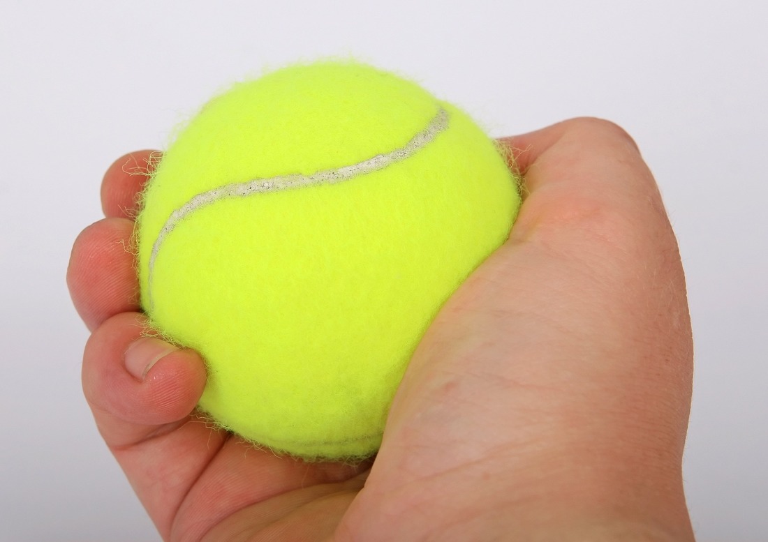
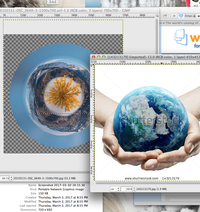
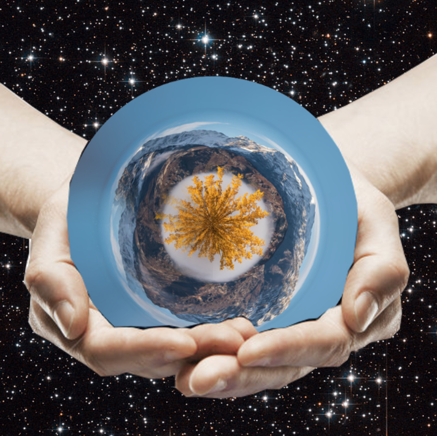
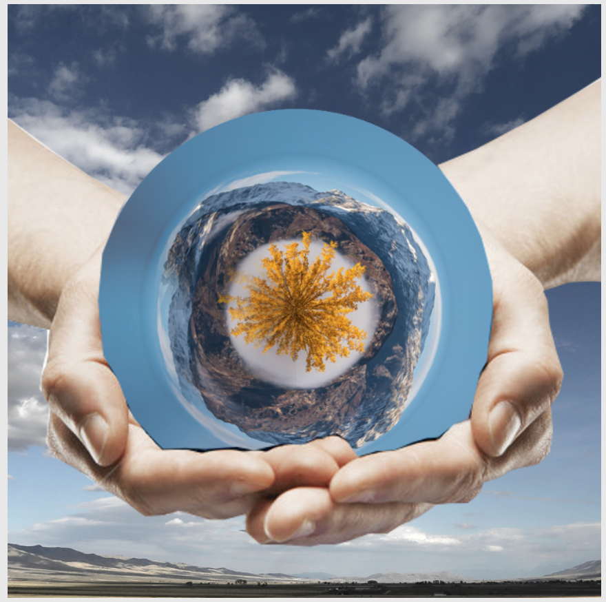
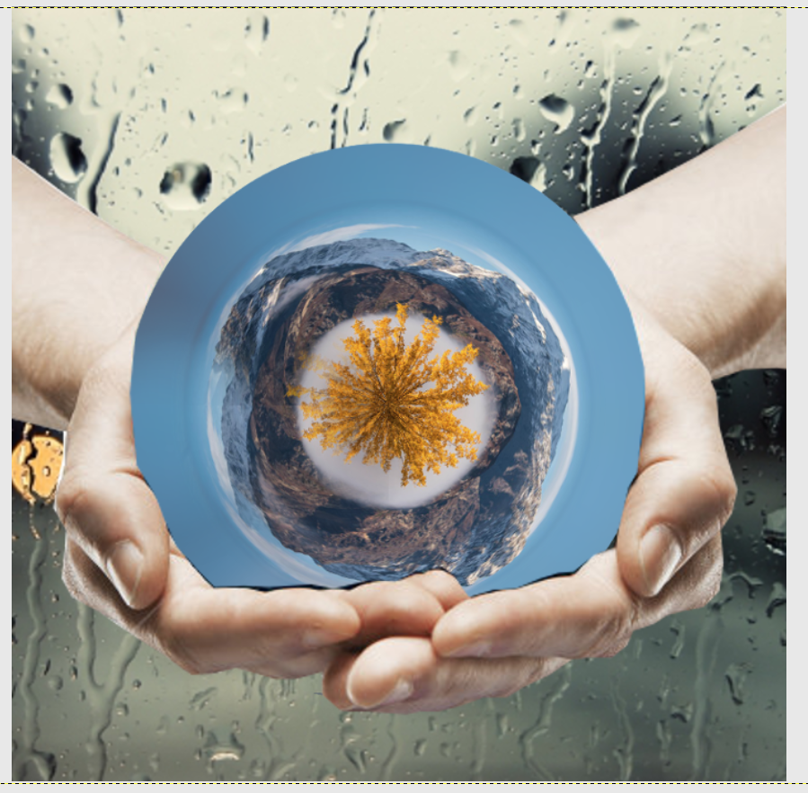
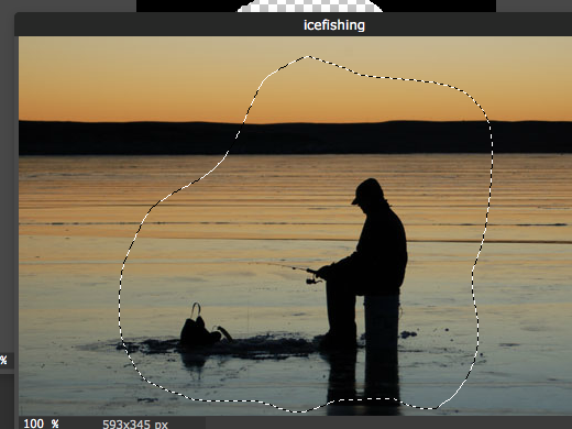
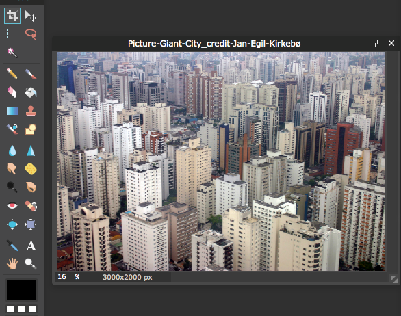
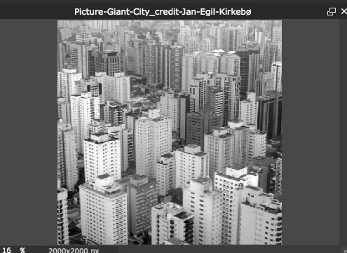
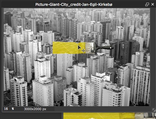
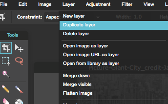
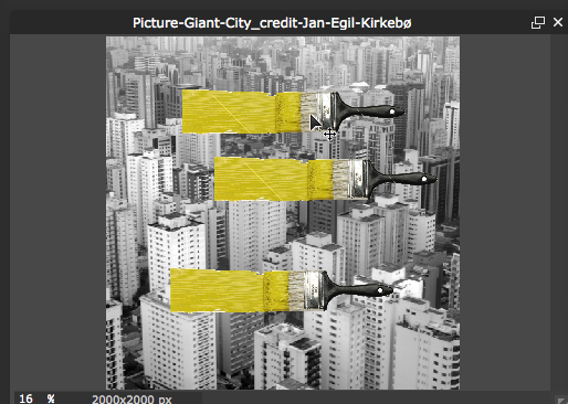
For your 3rd GIMP Project you will be creating Stereographic projection, which takes a standard photograph and stretches it around in a circle creating a globe or planet like image. Take a look at a few examples below. You will need to start off with finding an image you would like to use. Please not that you will want an image where the scenery stretches across the entire photo....otherwise when you wrap it in a circle, you will have large gaps. Also, make sure you choose an image where nothing is cut off on the sides. See an "OK" examples and "NOT OK" example below---you basically want the left and the right side to be similar looking (this will be easier to line things up in the end). ***REMEMBER TO LOOK AT RESOLUTION!!!!!!! Open your image in GIMP. Duplicate your background layer and hide it (Uncheck the Eye Icon) Crop your image so you have an even balance of sky and land (if necessary) Seamless Joint: With your Rectangle Selection tool. Select a rectangle from top to bottom on one side of your image. go to Select-->Float. Create a New Layer and Duplicate it. Move the Floated Layer Copy over to the other side of your image. Add Layer Mask to the Floated Layer Copy (right or control click on the layer and select "add layer mask") Double check that your layer window looks like this. 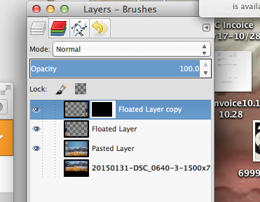 Using the BLEND Tool (Tools-->Paint Tools-->Blend Tool) click and drag in short spurts from left to right across the seam between your original image and your floated layer. Be sure to check your tool settings (Gradient should be FG-->Transparent or black to transparent, and the shape should be linear.) Be sure to adjust your opacity so that the layer looks blended with your image. 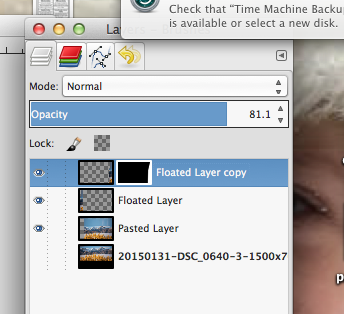 The right side of your picture should now resemble the left side. 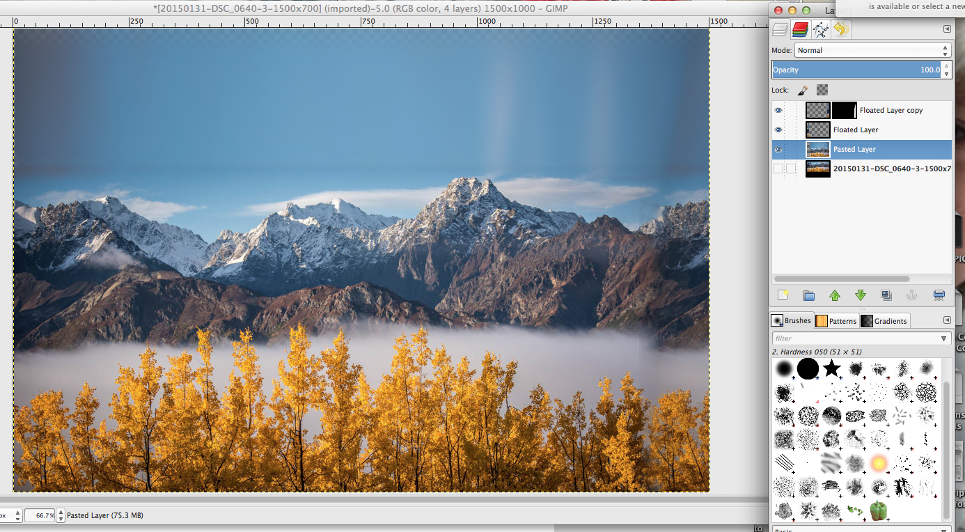 Apply Layer Mask (right/control click-->apply layer mask) Merge down your layers until you are back to two layers....your original image (hidden) and your edited version. Resizing to a square image: We will need a square image so go to IMAGE-->SCALE IMAGE Uncheck the proportions lock. Change your longest dimension to match your shortest (i.e. 1064X700 Pixels-->700X700 Pixels) To make the "Planet" go to FILTERS-->DISTORTS-->POLAR COORDINATES...settings are at 100 and 180 (See image below)....make sure TO POLAR is the only box selected.
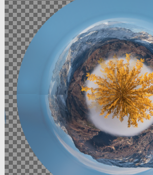
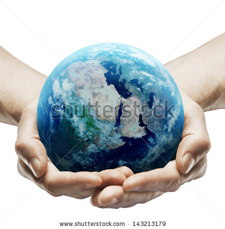
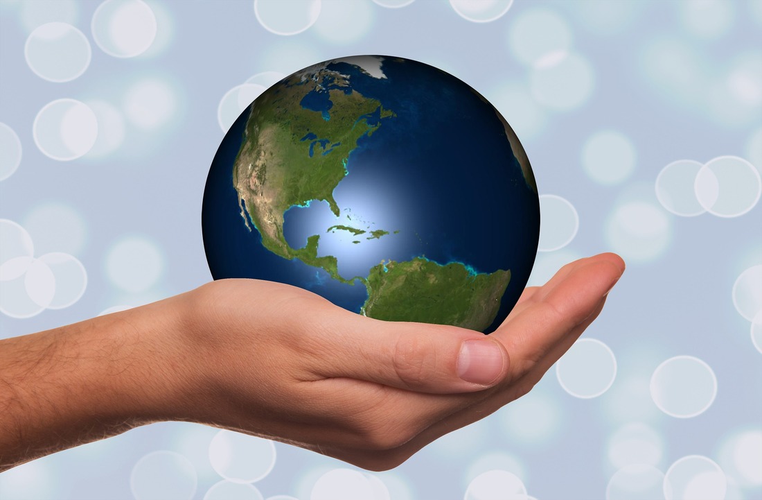
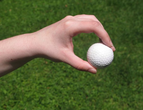
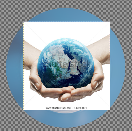
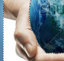
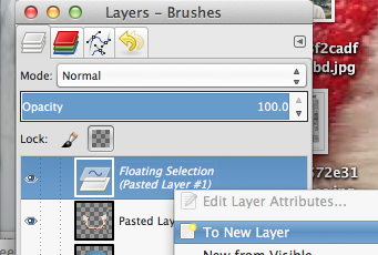
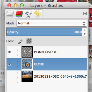
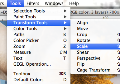
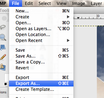
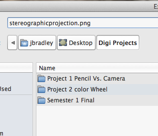
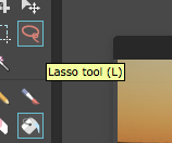
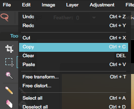
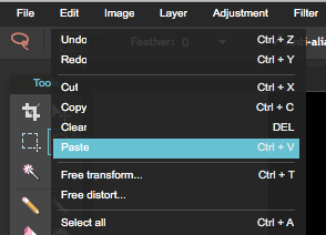
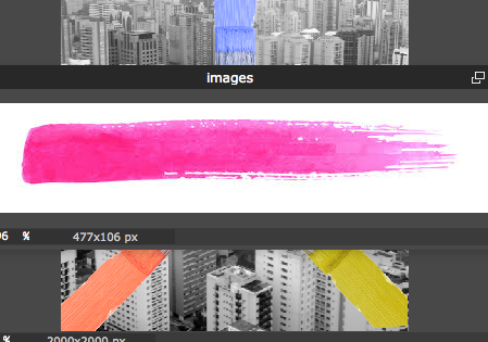
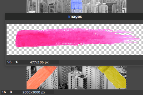
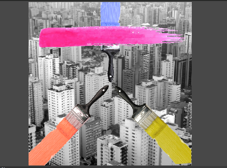
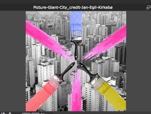
Use the Blend/Gradient Tool. Check your TOOL OPTIONS!!! Make sure that it is set at FG-->Transparent and a radial shape. With short strokes, blend the line/seam. You may have to undo a lot of these small moves if the look off. Command-->Z for Macs and Control-->Z for windows will be your friend. Apply the Layer mask and Merge the two layers together. Your final image should seem seamless. 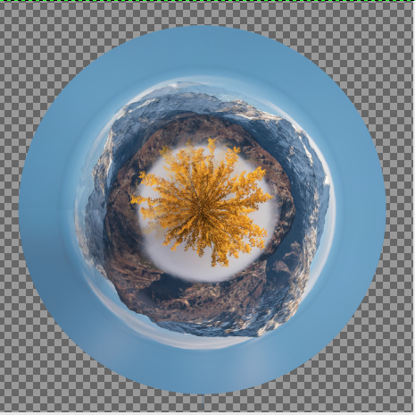 Now you can add a set of hands or a hand holding your "planet". Save one of the hand images below and open it in GIMP.....or you can find your own set of hands to use. click and drag your hand layer onto your stereographic image. make sure the hand layer is on top. Using your lasso tool, select only the hands in the image. Go to Edit-->Copy and Edit-->Paste to create a new layer. Next, Right/Control Click on your Floating Selection and click "To New Layer". Using your Scale Tool (scale) adjust the size of both your planet and your hands so that they fit together. Now play around with different background images When you are finished export the image as a .png or .jpeg (file-->Export As). Make sure you pay attention to where you export it so that you can find it later. Email it to me as an attachment.
0 Comments
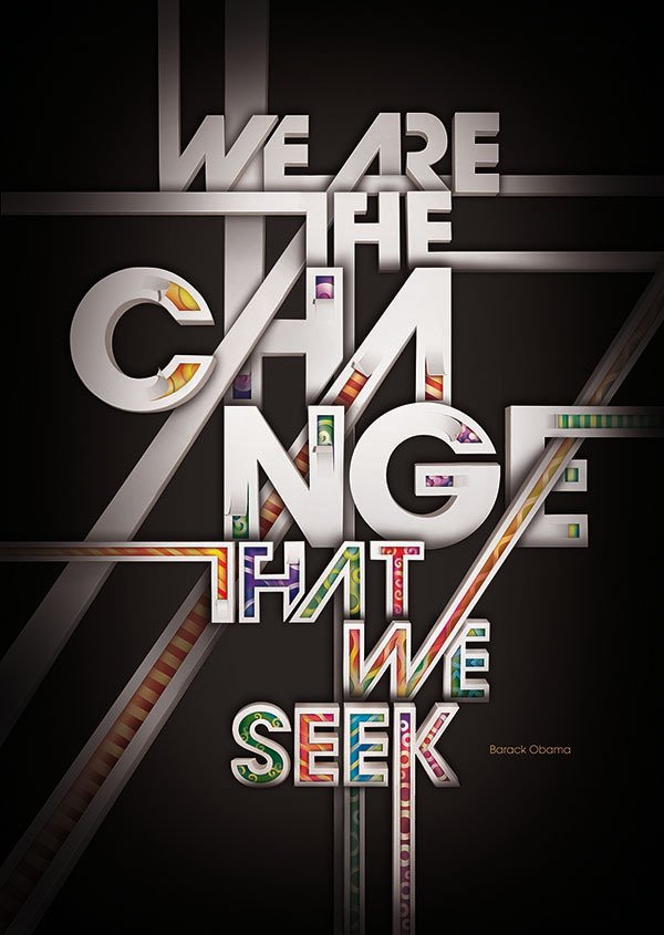
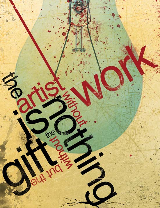
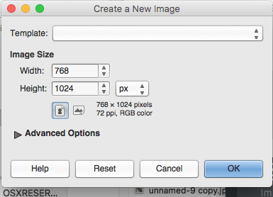
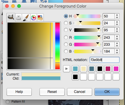
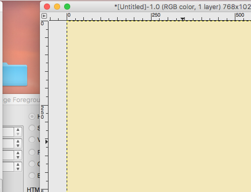
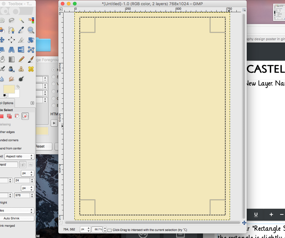
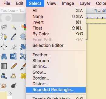
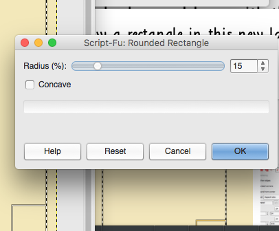
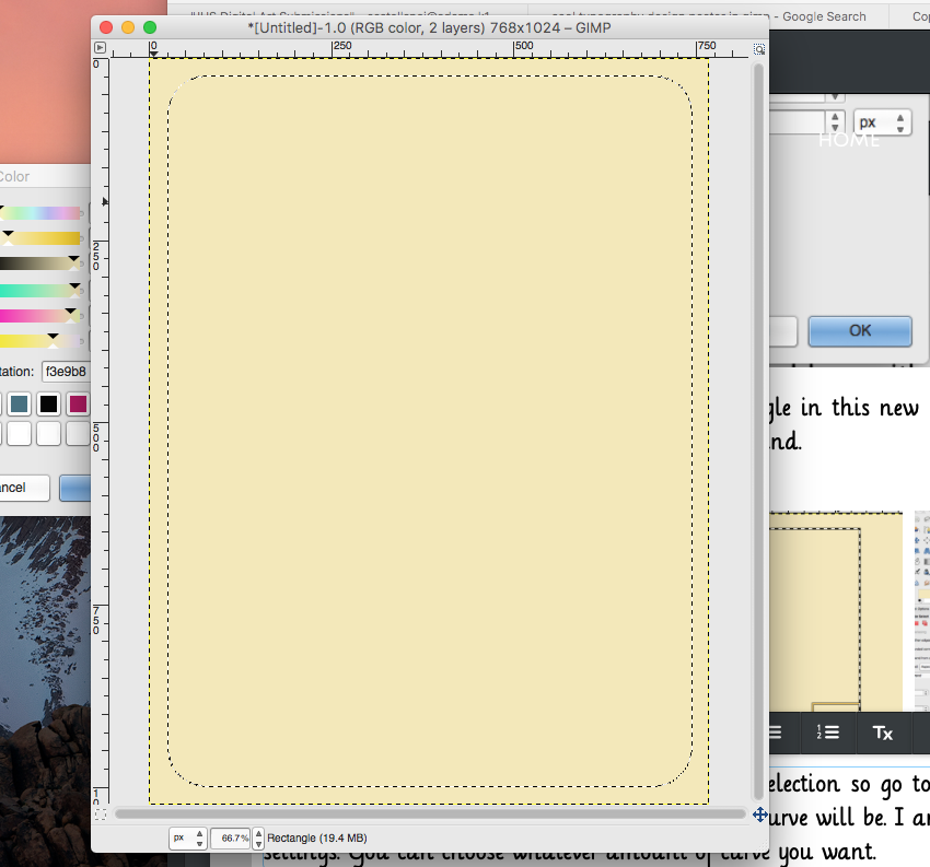
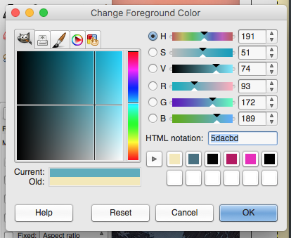
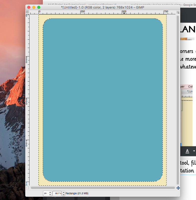
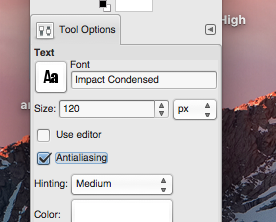
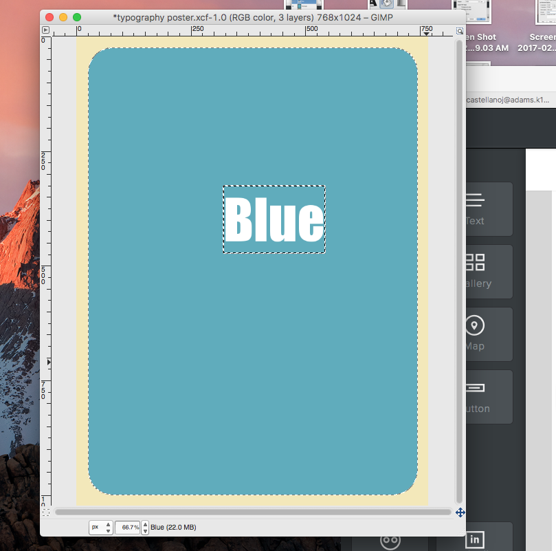
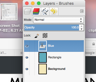
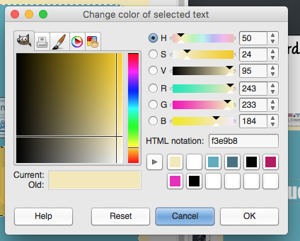
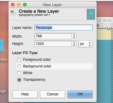
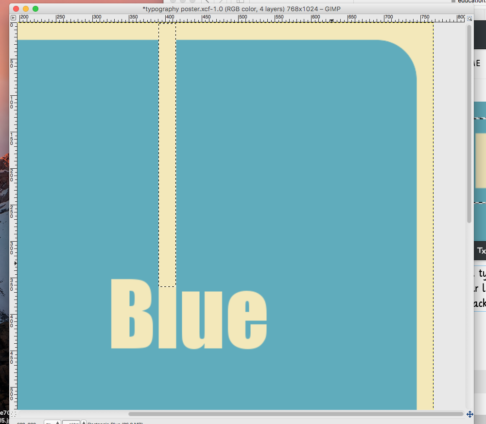
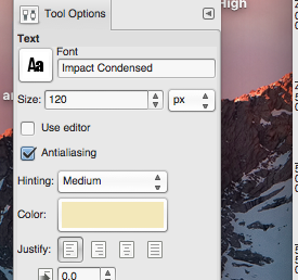
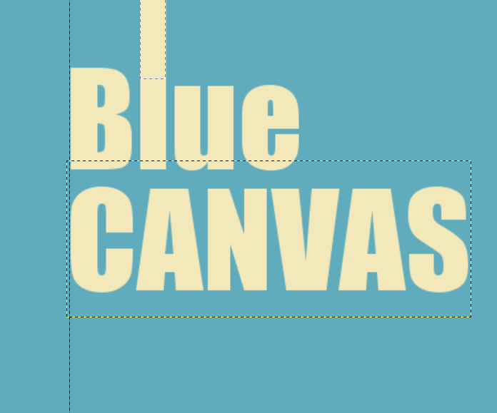
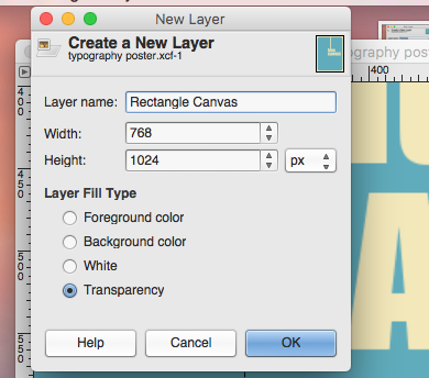
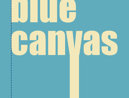
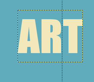
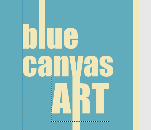
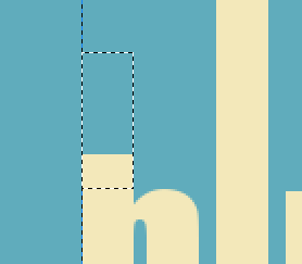
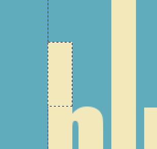
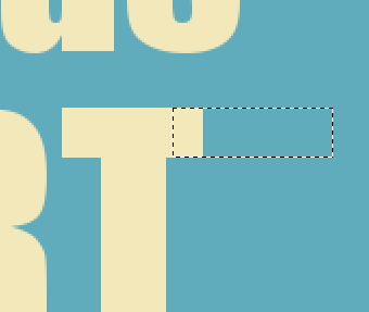
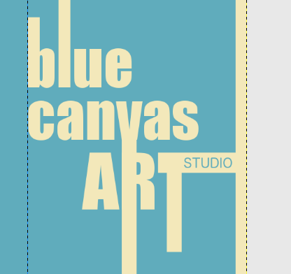
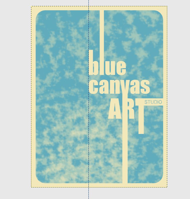
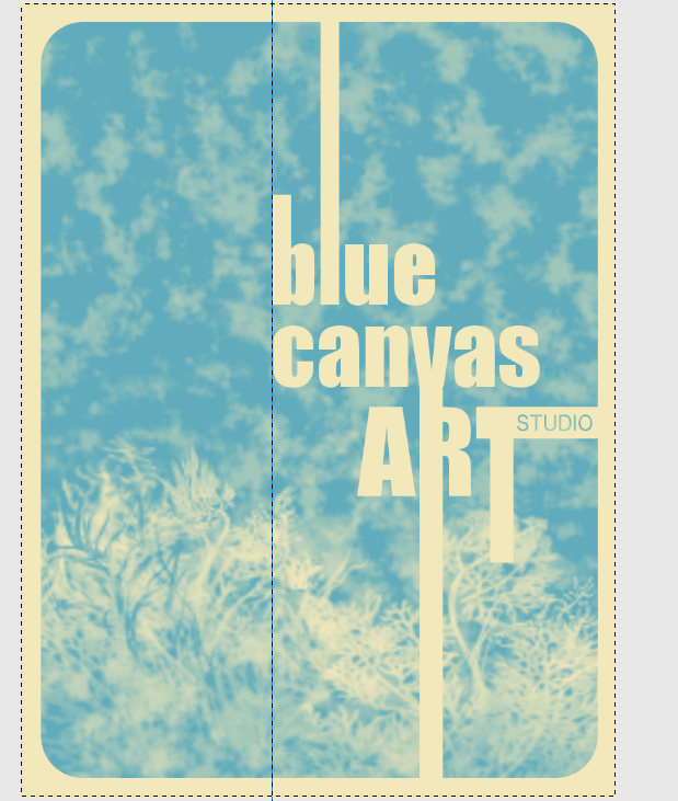
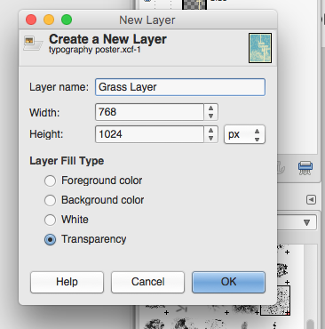
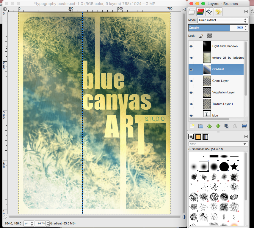
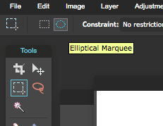
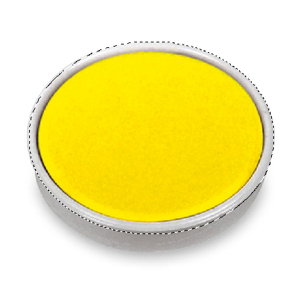
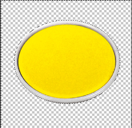
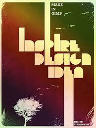 For this next project you will be creating a typography design poster. We will learn how to make some elements look rough or dirty, add texture, and create depth using light effects. We will focus Design Principles of Contrast, Emphasis, and Rhythm. Although I have created a step by step tutorial. You may choose whatever fonts, colors and images that will affect your final design. These will all look VERY different at the end. You still need to follow the instructions and use each tool that I use. But feel free to play around with settings and colors so that you get the look you want for your poster. I will be creating a poster for my art studio....Blue Canvas Art Studio....you may choose whatever you want. A local business, made up business, a quote or song lyric, a band or team.....anything goes. What to do....First you will need to create a New Document in GIMP. Set the Image Size to 768X1024 pixels. Make sure the Portrait orientation is selected. Click on your foreground color to change it. Choose whatever color you would like to use (this color will eventually be a thin border around the edge of your poster.) I went with a neutral tan color. If you look on the right side of the Change Foreground Color window you will see where you can enter a code under "HTML Notation"--the code for the color I used is f3e9b8 Using your paint bucket tool, fill in your background layer with this new color. Create a New Layer. Name this layer "Rectangle" with the background set as "Transparency" 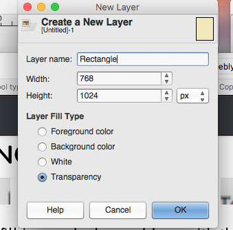 Using your "Rectangle Select Tool" draw a rectangle in this new layer. Adjust the size so that the rectangle is slightly smaller than the background. We want to round the corners of this rectangle selection so go to Select-->Rounded Rectangle. The higher the Radius the more pronounced the curve will be. I am going to go with 15 for my settings. You can choose whatever amount of curve you want. Using your "Bucket Fill" tool, fill this rectangle with a different color. I am going to go with a medium blue (HTML Notation 5dacbd)--you want to make sure you do not choose too light of a color for this layer. Next, we will create some text. For the Typeface, I used a font called Impact Condensed....(choose whatever you like--this font should be bold)....my font size is set at 120....yours may be different depending on the font you choose. Either way this should be large so start at 120 and you can adjust it later. Click any where on your image and type the first word of your poster. Using your Move Tool, you can position the word wherever you want. Double check your Layers Window to see that they are in the correct order. Make your font color the same color of your background. Create a New Layer. Name this layer, "Rectangle (word you typed)" Using the Rectangle Select Tool, create a rectangle extending from the top of one of your letters...make your rectangle go all the way to the top of your canvas. Fill it with the original background color (f3e9b8). Create another Text Layer using the Type Tool. Using the same font (size can change depending on what you are typing) type in your second line and move it to the right place below you first word. Create another New Layer and name it "Rectangle (second word you typed)". Repeat the same steps as before to draw a rectangle extending from a letter in this word to the bottom of your image. Fill it with your background color. Select the Type Tool again and type your 3rd and final line....I am using ART. Use the same background color but play around with the font size until you find the right look. Move your text so that one letter lines up with the bottom rectangle. Create another new layer. Play around with your rectangle select tool to add more shape to your text. Name that layer "Extra Shapes" with the background fill set as Transparency. 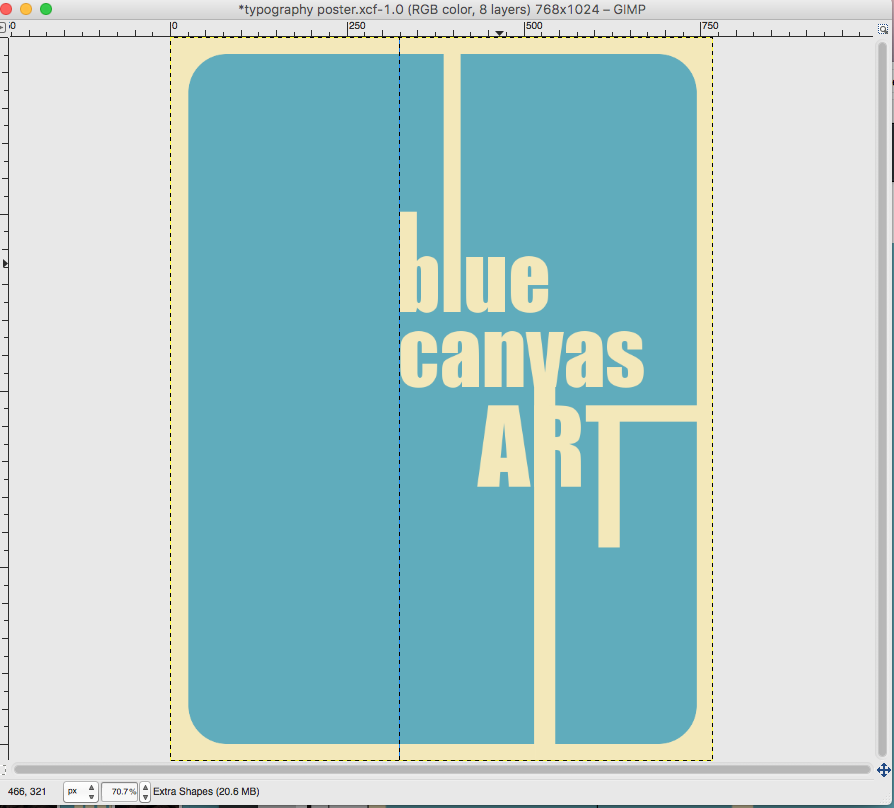
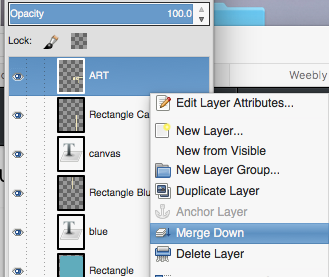
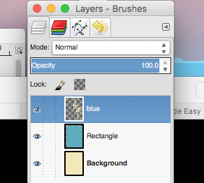
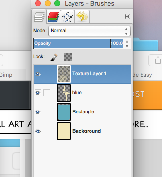
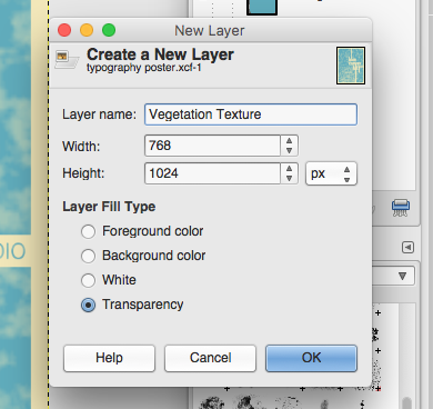
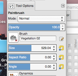
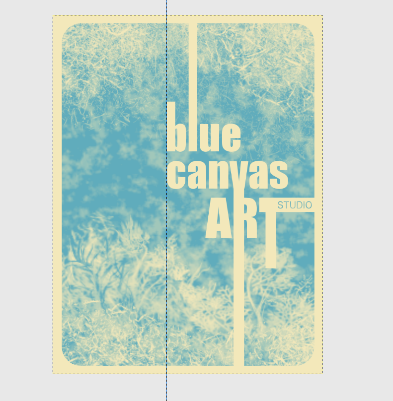
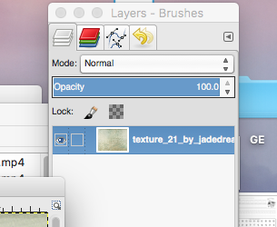
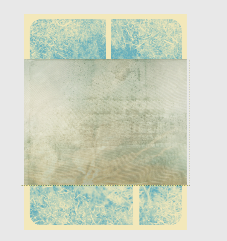
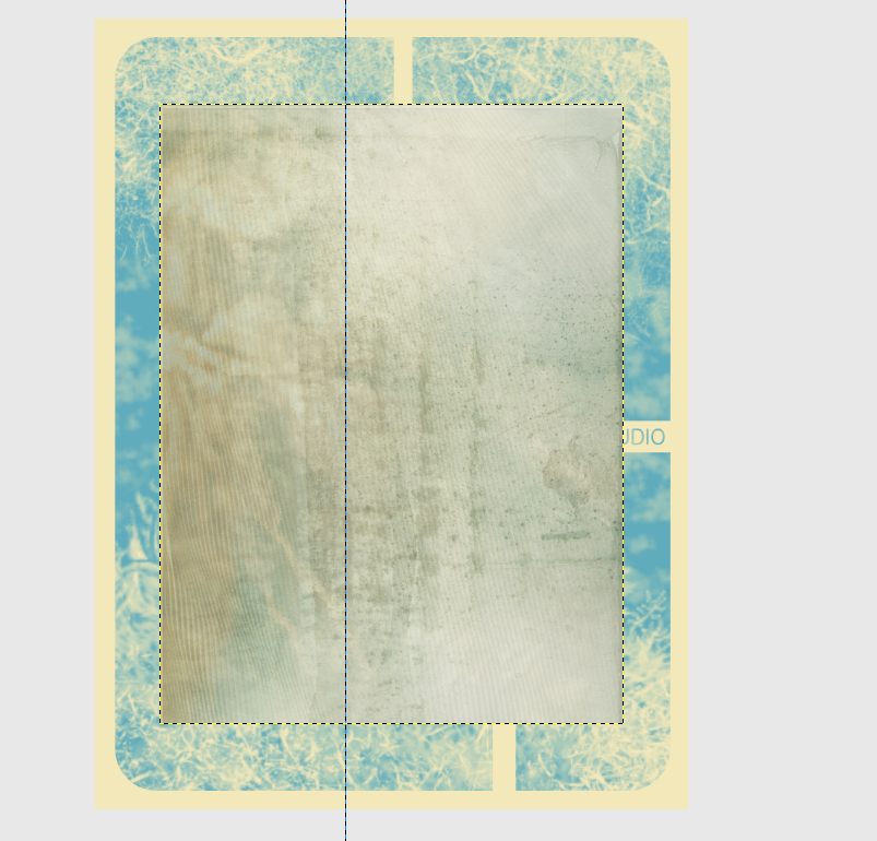
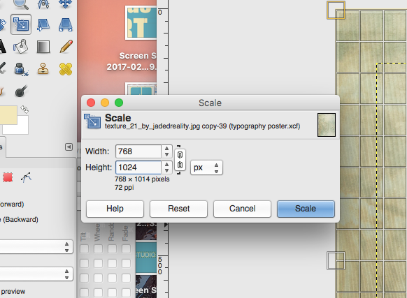
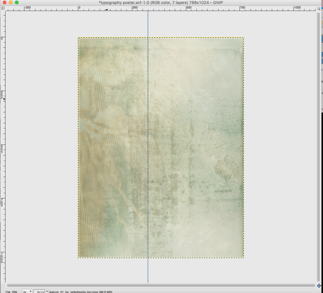
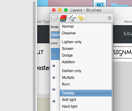
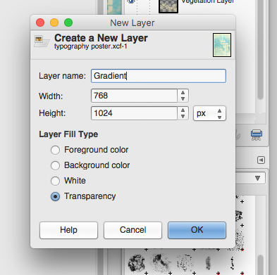
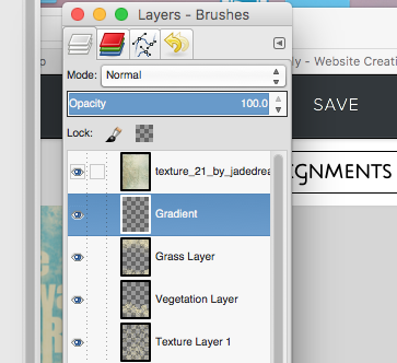
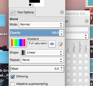
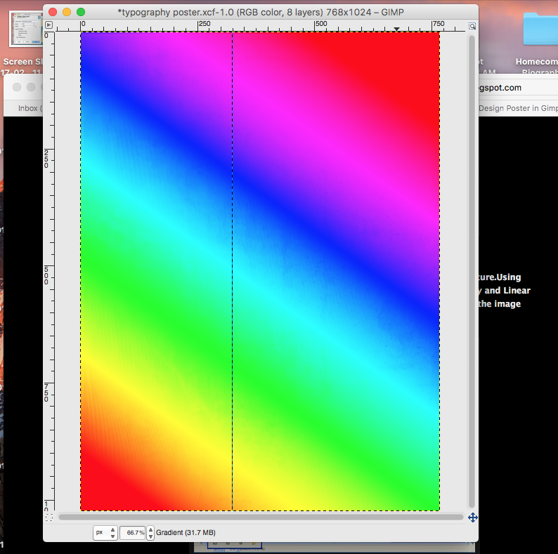
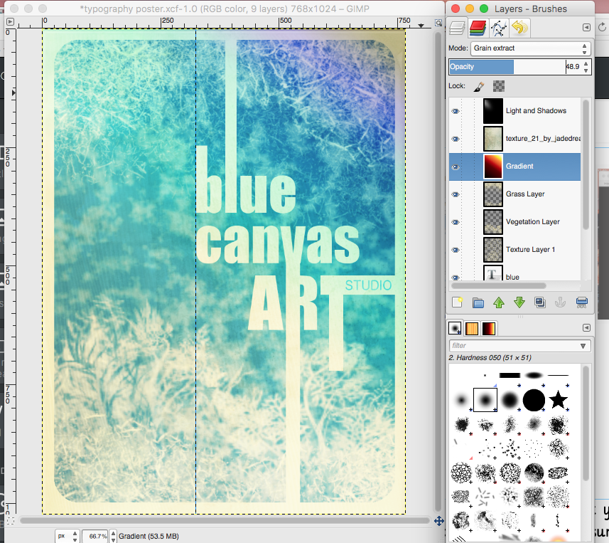
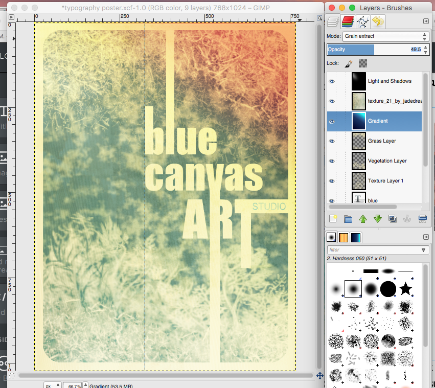
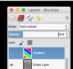
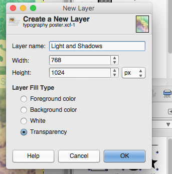
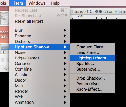
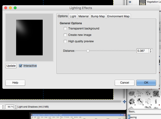
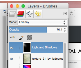
Next you will "MERGE" all text layers into one. With your top layer selected, Right Click or Control Click on that layer and select merge down. This will merge the first two layers together. Continue to do this until you have merged all of your text layers together. DO NOT merge with your back ground rectangles just yet. Remember, once you do this you will not be able to move around your text separately...it will all be one layer. Create a new layer. Name this layer "Texture Layer 1". Explore different brushes to create some texture in the background. Don't go overboard as we will be adding a lot more to the image. You will probably want your brush size to be quite large so that you can just click once or twice to stamp a texture onto your rectangle. I chose to use the Chalk 02 Brush--Size 821. I also changed the opacity of the brush to Create another new layer to add some more texture (I used the vegetation 02 brush so I named this layer Vegetation). Stamp this new texture at the bottom, or side of your text to create some variety--Set the opacity of this brush to 100. Create Another New Texture Layer (I chose to use Grass as my brush). Experiment with Brush Size and Opacity to get another layer of texture on your image. Be careful not to stamp a High Opacity Brush right over your text layer. You will need to Save this Image to your computer and Open it in GIMP. 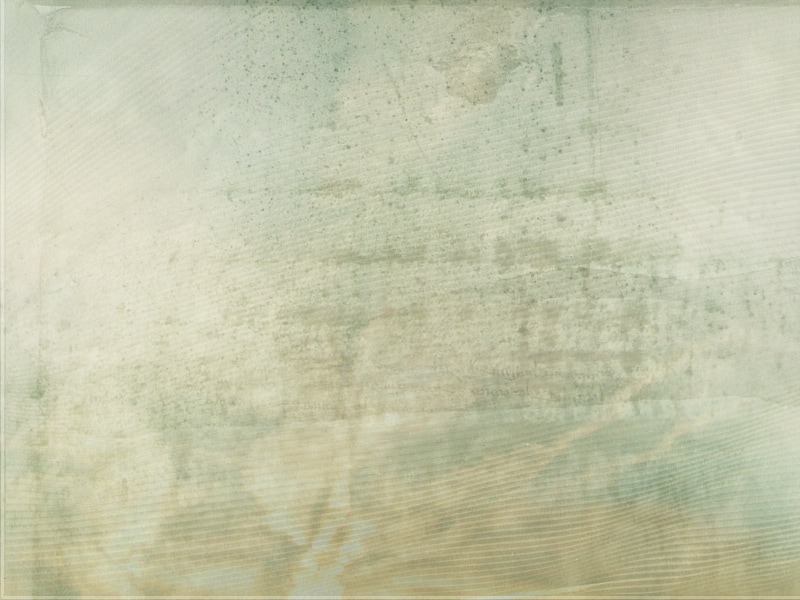 Drag the "Texture" Layer onto your poster design. Rotate the image using the Rotate Tool (90 Degrees) Using the Scale Tool, change the size of this layer to fit the size of your poster (768X1024 Pixels) Set the Layer Mode to OVERLAY Create a new layer and name it "Gradient". Place it behind....or underneath the Texture Layer you just created. In the Tool Options window select your gradient type (I chose Full Saturation Spectrum--there are three other options displayed below). Set the Shape to Linear and keep the Opacity at 100. Click and drag from one corner to the other. In your layers window. Set the Mode to Grain Extract and set your Opacity of this layer to 24.8--whatever it takes to see your poster again. Check to make sure your layers are in the right order. Now create a new layer on top. Name it "Light and Shadows". Fill it with Black. Go to Filter-->Light and Shadows--> Lighting Effects. Play around with the settings until you get a light effect that you want. Apply the filter. Set the Layer Mode to Overlay and adjust the OPACITY if you need to. 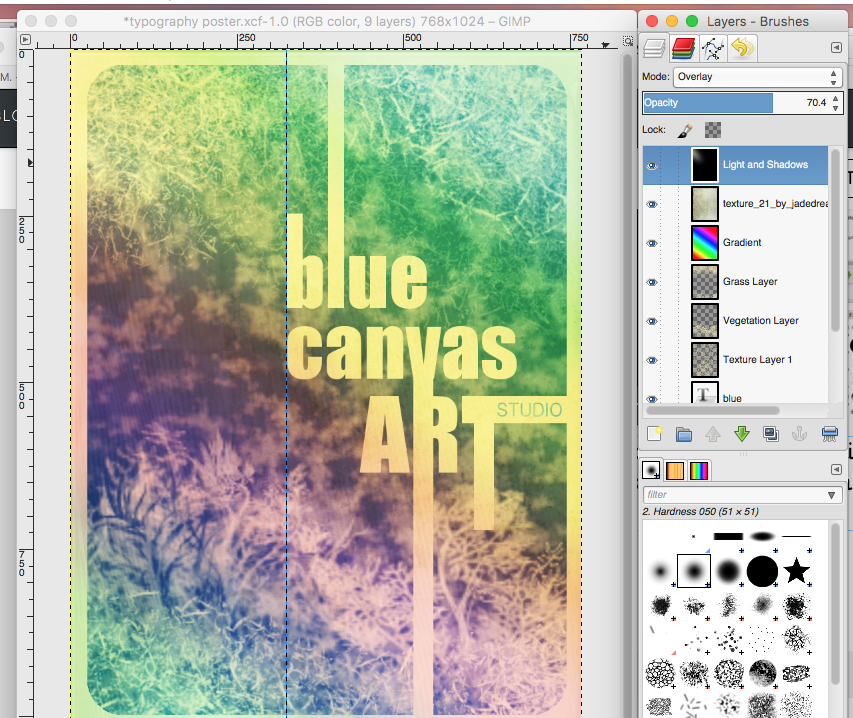 When you are finished go to File-->Export As to export your poster as a .png
Email your final poster to me.
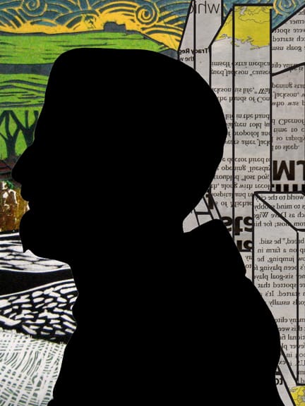
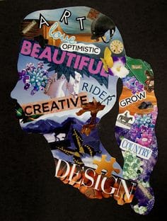
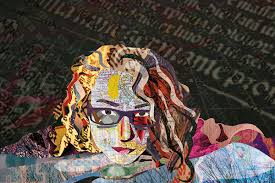
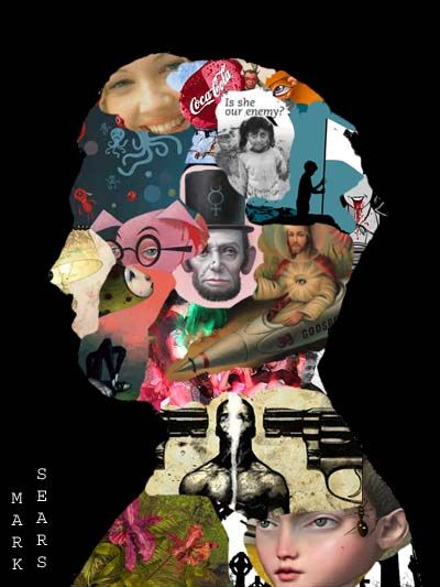
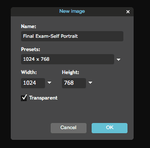
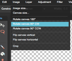
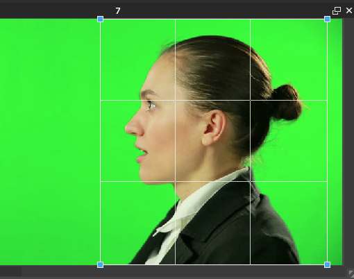
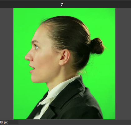
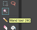
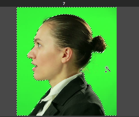
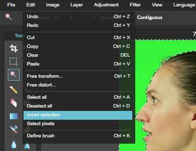
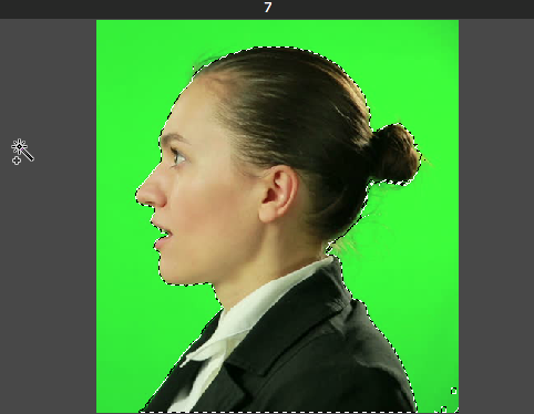
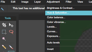
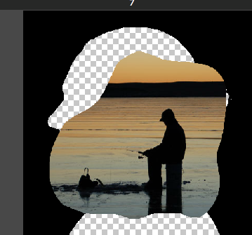
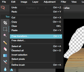
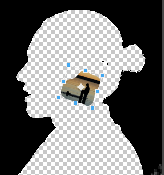
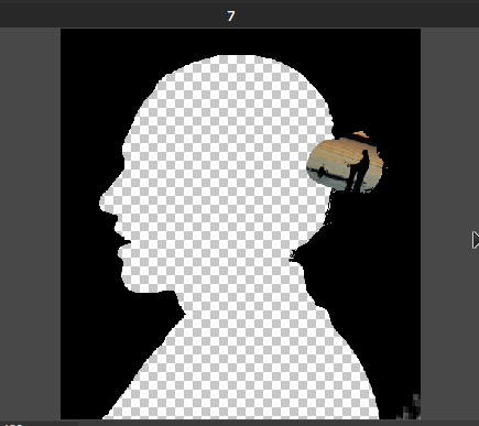
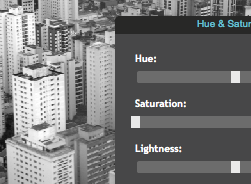
Step By Step Tutorial: 1.) Start by creating a new image. 2.) Title your project: Final Exam Semester 1 (or something like that) 3.) In your Presents--Select 1024x768 to select your canvas size. 4.) Click "OK" 5.) Go to "Image" and "Rotate Canvas 90 degrees CW" to rotate your canvas into PORTRAIT ORIENTATION 6.) Take a profile photo in front of the Green Screen. 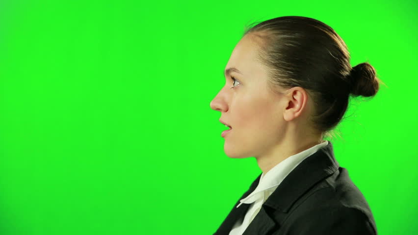 7.) Open in Pixlr Editor. 8.) Unlock the background layer 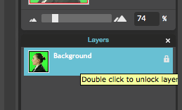 9.) Crop image. 10.) Use the Wand Tool to select the green backround. 11.) INVERT your selection by going to "Edit-->Invert Selection" Only your profile should be selected now rather than the background. 12.) Delete your portrait so that the green is all that is left. You should see the gray and white checkered print when you delete your face. 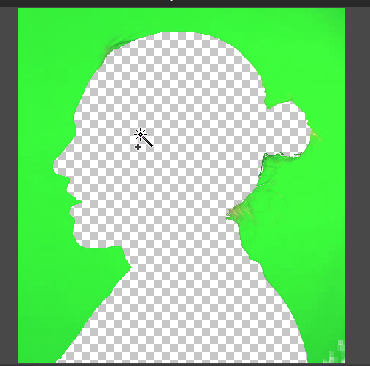 13.) Now you need to change the green so that it is black. The easiest way to do this is to go to.... - "Adjustment-->Hue and Saturation" - Pull the Saturation slider all the way to the left (-100) - Pull the Lightness slider all the way to the left (-100) 14.) now you are ready to find images to layer behind your silhouette. 15.) find and save images of things that you like or that represent you. One at a time, open them in Pixlr. 16.) Use the lasso tool to select the part of the image you would like to use. 17.) Edit-->Copy 18.) In your Silhouette window go to Edit-->Paste 19.) you will need to resize your image using Edit-->Free Transform 20.) Layering and Placement: - You need to have your black silhouette as your "TOP" layer. To do this you need to drag it up above your image layers. -This way you can place images at the edge of your silhouette and the black will overlap the image so we can still see your silhouette. 21.) Repeat this process with all of your images. You should have roughly 25-30 images in your Self Portrait. I will be flexible with this number but I just wanted to give you a ballpark number. SAVING!!!!!!! Each day when you save your file... -Save it in your Pixlr Library -File Format Should be PXD-Layered Pixlr Image 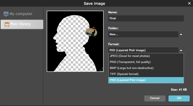 Otherwise your work will be flattened into one image and can no longer work with individual layers. This means you will most likely have to START OVER :( YOU WILL BE GRADED ON.....
- Craftsmanship - Effort (you have two weeks to work on this project, it should not only take you 2-3 days to get done.) - Use of editing tools (don't just drag every photo as is onto your artwork) it should be edited or manipulated in some way--(cut out, use a filter, change the hue and saturation etc) - Number of images--I will be flexible with this number--but shoot for 25-30 images. - Include a Text/Type element--See Pixlr Tutorial #4 This is a step by step tutorial of how I created my color wheel. This does not have to be the way you do your project. It is simply a starting point if you are stumped. 1.) Go to Pixlr Editor 2.) Find an image for the background. Go to "Adjustments"-->"Hue and Saturation" to Desaturate your photo (black and white). 3.) Crop your background image so you have a square. 4.) Find an object to use for your Primary Colors. Unlock the background layer. Delete the background, and drag the layer onto your black and white image. **Hint! it will be easiest if you select an image of the object with a plain background. It will be easier to select and delete the background. 5.) Go to "LAYER-->Duplicate" Layer to duplicate this layer twice so that you have three of the same images. 6.) Go to "Adjustments-->Hue and Saturation" to change the HUE of each layer so that you have the PRIMARY COLORS (Red, Blue, Yellow). 7.) Go to "Edit-->Free Transform" to rotate and resize your images so they are in the right place. 8.) Find an object to use for your Secondary Colors . Unlock the background layer. Delete the background, and drag the layer onto your black and white image. **Hint! it will be easiest if you select an image of the object with a plain background. It will be easier to select and delete the background. 9.) Duplicate the layer twice. You should have three of the same layer to create your Secondary Colors.. Using "Edit-->Free Transfrom" Arrange each element where they belong to represent the secondary colors. 10.) Using "Adjustments-->Hue and Saturation" you should be able to change the Hue to match that of the Secondary Colors (Green, Orange, Purple) 11.) Find an object to use for your Tertiary Colors. Duplicate and arrange that object in your composition. 12.) Adjust the Hue and Saturation to create a minimum of 12 Tertiary Colors. 13.) if you finish and have time to spare you can add tints and shades for extra credit. Print you final color wheel to submit. Email it to me as well. [email protected]  What is Pencil vs. Camera Art? "Pencil Vs Camera" is an imaginative and fun art form pioneered by Belgian visual artist Ben Heine that began in 2010. Blending photography and drawings, Heine brings together real photographs with fantastical sketches into a fascinating mixed medium where the artist's hand is always present in the images to represent the connection between viewer, artist and artwork. What is Surrealism? Surrealism is an art movement that began in the 1920s. It was all about experimenting with your imagination. Surrealists artist like Rene Magritte, Salavador Dali and Joan Miro liked to juxtapose objects that were not normally seen together or create scenarios that didn't quite make sense and were a stretch from reality. Contemporary Artist Ben Heine uses surrealism in MANY of his creations. Try to find an example of surrealism in some of his works. Project: You will be creating a work of art inspired by the work of Artist Ben Heine. You will be required to include photography and drawing in your completed work. Steps: 1.) Choose a photo or take a photo that you would like to work with (make sure it is high resolution 1000x1000 pixels or more is ideal). 2.) Make a plan for your drawing 3.) tear a piece of paper to create your drawing. 4.) Start Drawing! (be sure to tape your drawing down to your photo before beginning) 5.) Upload your original photo to Pixlr. 6.) Take a photo of your hand holding your drawing in front of a green screen and upload it to Pixlr. 7.) Remove the green background and rotate, resize and/or crop the photo of your hand so that it fits with your original photo. This Project is Due Next Friday (December 9th) at the end of class. I will be covering the tools you will need to know to complete this project throughout the week. You will have some In-Class assignments and tutorials you will also be graded on including your weekly Blog assignment. |
Mrs. CastellanoDigital Art Archives
May 2017
Categories
All
|


 RSS Feed